"薄っぺらい"美学を探索する | Exploring the "Ultra-Thin" Aesthetic
<!--JA-->
GILLOCHINDOX☆GILLOCHINDAE、Youfire、山本和真による展示「極薄inframince」。ギャラリー「CON_」のこけら落としでもある本展は、作家が自律的に制作をおこないつつも、その間ひたすら画像を送り合い、ノリをシェアしながらつくられた。イメージを通じてつながり、都市や既製品、遊戯といったモチーフを共有する三人の制作過程や、それぞれの作品について聞く。
Text: Seshimo Shota All Photo: Naoki Takehisa
Title: Ultra-thin(極薄)
Artist: GILLOCHINDOX☆GILLOCHINDAE, Kazuma Yamamoto, Youfire
Term: 2022.4.2(SAT) - 5.1(SUN) Opening reception: 4.1(FRI) 18:00-21:00
at CON_
──まずはじめに、今回の展示のコンセプトを教えてください。
GILLOCHINDOX☆GILLOCHINDAE(以下、ギロチン):マルセル・デュシャンの造語「inframince」(アンフラマンス)を、その日本語訳でもある「極薄」と連ねたものです。最初はinframinceという言葉を僕が本で見つけました。それで二人に共有したら反応がよくて。
山本:僕はギロチンに言われるまでこの言葉は知りませんでした。調べていったら、もともと自分が考えていたことに近かった。アンフラマンスって、日本語で訳すと極薄って言い方になるけど、意味的には薄さを超えているみたいなことなんですよね。そこにしっくりきました。
ギロチン:ちょっと誤訳かもしれないっていう議論もあって、極薄って表現の誤訳しちゃった感じがおもしろいですよね。
Youfire:死後に発見されたよくわからないメモっていう背景もカッコいい。個人的には、観る対象としてデュシャンがめちゃくちゃ好きだし、俺の作品はレディメイドといえばレディメイドだし、そういう意味でも違和感はなかったかな。
あと大事だと思うのは、文字の視覚的なカッコよさや響き。最終的に「極薄」と「inframince」を並べて、「極薄inframince」としたことがよかったです。途中で何度か言葉を入れ替えたり、いろいろ試したりして、このかたちに落ち着いた。
山本:そうだね。映画のタイトルというか、「極薄──inframince」みたいな副題っぽい感じが好き。
[ひたすら画像を送り合う]
──コンセプトづくりや制作の過程はどういうものでしたか?
ギロチン:展示をやることになって、まずそれぞれのバックグラウンドを共有して、ノリを合わせる作業をやりました。小さいころに好きだったオモチャとか、中学校の部活とか、いろいろ聞いていって。そのあと好きな単語を共有していきました。てきとうに思いついた言葉から本で見つけたものまで。コンセプトもそのなかで生まれています。
山本:制作が始まってからは、話し合うっていうより、画像のやりとりって感じだったよね。
ギロチン:そうそう。InstagramのDMグループで延々と画像を共有していった。これはオッケー、これはダメ、みたいな。それぞれの作品のコンセプトを深く聞くというよりは、そういうコミュニケーションの仕方ですね。
Youfire:画像に画像で返していく感じ。いわゆるリファレンスになるものだけじゃなくて、制作と関係ないけどよかった作品とか展示とか、服とかもどんどんシェアして。
山本:この工程が大事だったと思う。僕には画像を送り合って刺激を受ける知り合いが二人いて、藝大の先端の友人と、いま不動産の会社をやっている高校の同級生なんですけど。そういうふうに感覚を共有できる人たちはほかにいなかったし、まして実際に展示をやるのは今回が初めてだったから。
──おもしろいですね、この三人で展示をやろうということになった経緯はどのようなものだったんですか?
ギロチン:僕は展示全体のディレクションもやっているので、CON_の加藤さんや遠山さんと話しながら決めました。最初の展示だしこれまでのギャラリーにないような作品をつくるアーティストと一緒にやりたいねって会話があって、Youfireと和真が合うんじゃないかって。
二人と会ったことはなかったけど、作品自体にも共通するモチーフがあるし、TwitterやInstagramにあげている画像やミームの雰囲気もなんとなく似ている。価値観が合う気がしました。
山本:三人ともずっと画像をあげてるよね。イメージの強い人たちなんだと思う。
Youfire:そこは本当に似てる。最初にギロチンから「今度〈獸〉の展示に来てほしい」ってDMが来て、そのときワンチャン誘われるのかなと思った。で、行ったら本当に誘われた(笑)。
ギロチン:そうそう。先にYoufireを誘って、そのあと同じように和真にもDMして、Youfireと一緒に藝大に乗り込んだ。
山本:最初は藝大の食堂で会って、それぞれの好きなアーティストとか画像とかをいろいろ見せ合いました。
Youfire:会ったときにも思ったけど、SNSの使い方というか、振る舞い方も共通している感じがする。うまく言えないけど、Twitterでデカい声でコミュニケーションするわけでもなく、アンダーグラウンドを気取るわけでもなくみたいな。
山本:二人のそういう感覚は信頼できるなって思ったよ。
ギロチン:SNSだけじゃなくて、展示を考えるうえでも、アンダーグラウンドに寄りすぎてお金が回らなくてリタイアするのも不健康だし、ストリートアートやプリンティングのムーブメントに寄りすぎるのも違うような気がするからね。その間をちゃんと保つっていうか。
[偽物のモチーフから──山本和真]
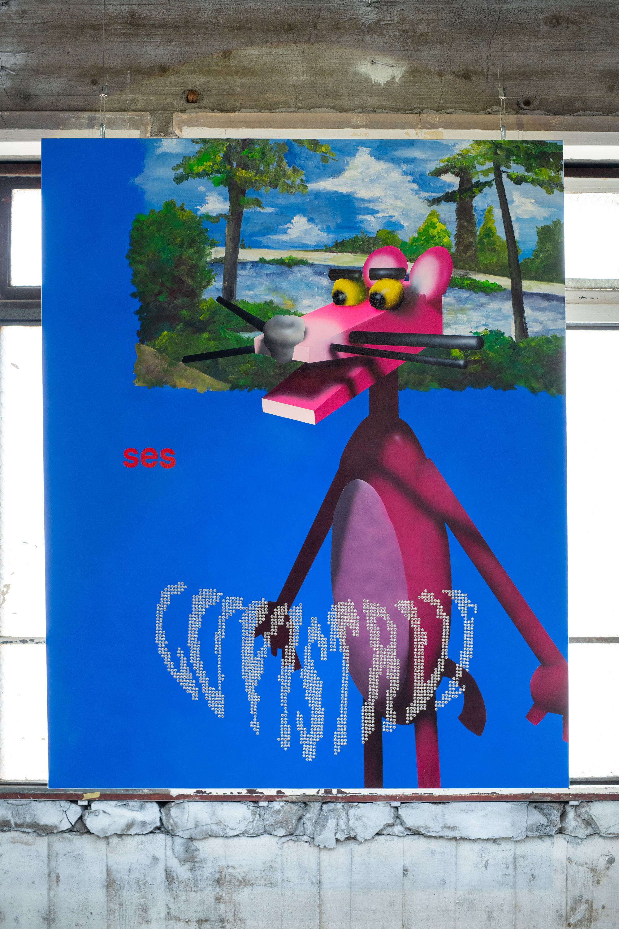
──そうして展示のコンセプトや内容が決まっていったと。それぞれの作品についても聞いていいですか。まず、山本さんの作品「Non Believer」について。素朴な質問ですが、この「ses」って文字はなんでしょうか。
山本:「ses」は、トルコの廃盤になった60年代の雑誌のタイトルですね。この作品はそういったモチーフをフロイトの自由連想法からヒントを得て、連想ゲームのように連鎖させて制作しています。上にあるのはセザンヌの大水浴を参照したもので、実際の絵画では人間が描かれているのですが消してしまい、代わりに人間っぽい動物としてピンクパンサーを描きました。さらにピンクパンサーの由来となった薄桃色のダイアモンドからラインストーンも置いて、「表層的な偽物らしさ」を出しています。偽物に共通する未成熟さや下手さ、稚拙さは、僕の作品のテーマです。
ギロチン:ほんといいよね、これ。和真の作品は、まずパッと見のビジュアルがめっちゃ好き。説明を聞いて、さらにわかってきた感じがする。
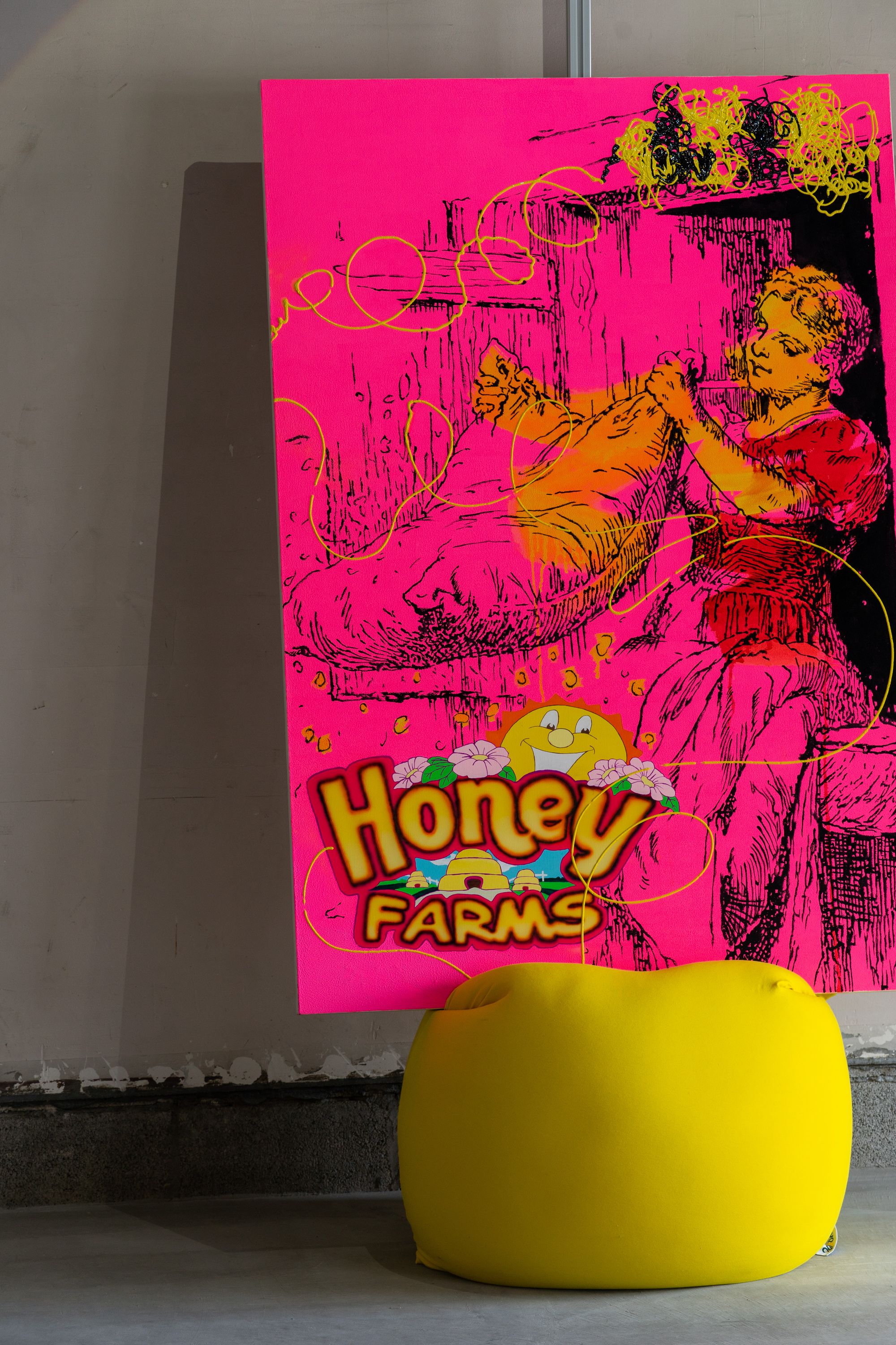
山本:ありがとう。同じように「Honey FARMS」にも偽物感があります。これはドリームワークスの「ビー・ムービー」っていうアニメーション映画を引用したものです。ディズニーの「バグズ・ライフ」ってありますよね。ドリームワークスアニメーションはその人気に対抗して、「アンツ」とか「ビー・ムービー」とか、アリやハチが出てくる作品を制作するんだけど、ディズニーには勝てなかった。絵のなかにある「Honey FARMS」は、「ビー・ムービー」に出てくる架空の養蜂場のロゴです。この養蜂場はハチからみると仲間を拉致して監禁する悪の象徴であり、人間から見ると食を支える養蜂場でありハチミツ会社。神話におけるトリックスターの存在が、大衆の物語の中で形骸化され、立場によって善と悪が同居するトリックスターとして「Honey FARMS」の存在が成立しているのが面白いと思った。ペラペラの作品のなかに、ペラペラの「薄すぎる」ロゴがあるところが、展示のコンセプトとも響き合っていておもしろいかなと。
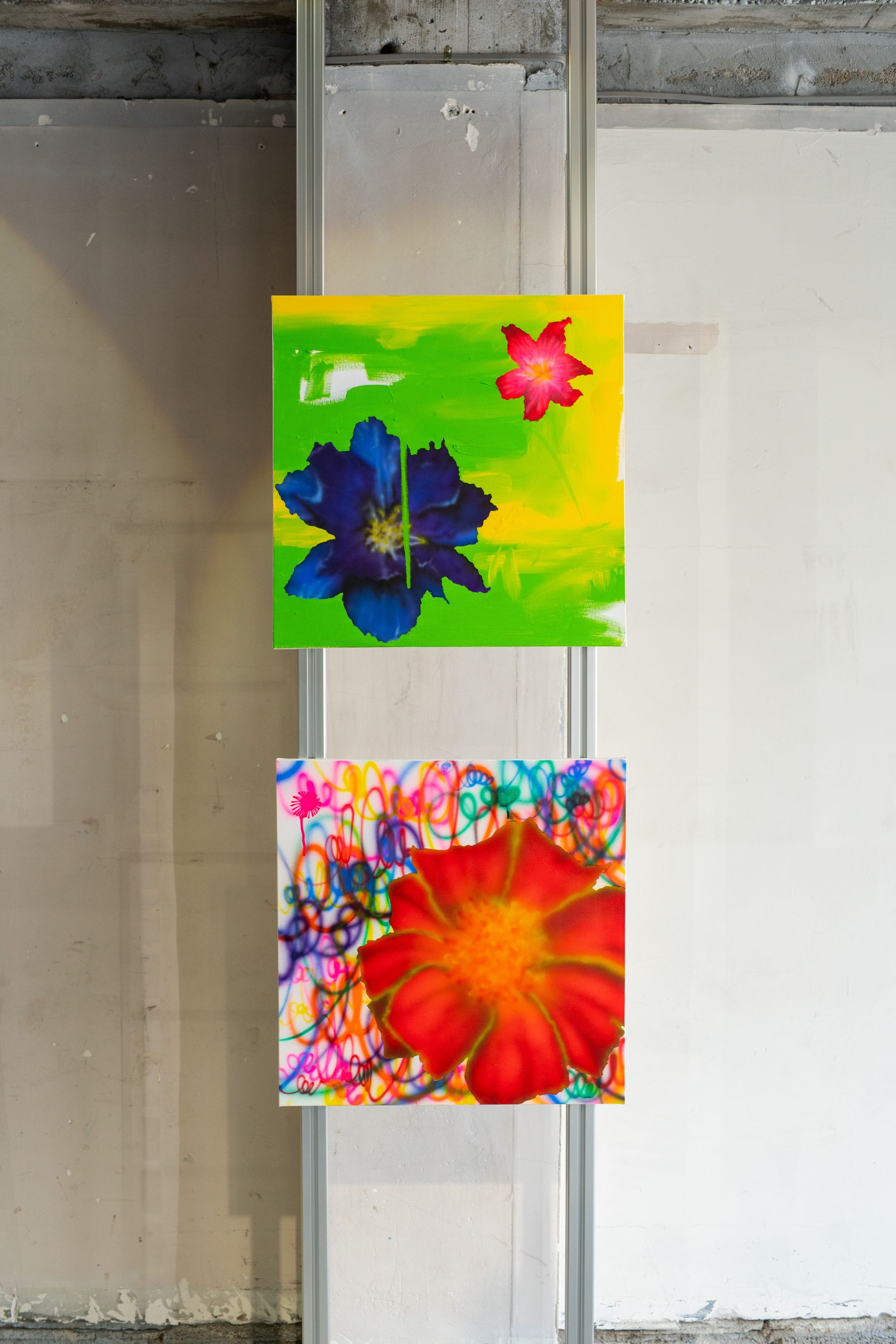
最後に「Flower2」「Flower3」「868.07」などは、実際にある花ですが、毒をもっています。毒がありながらも、なるべく明るく、安全に見せるように描いています。毒を持ったものに薄い安全に見える入り口を作り鑑賞者を誘引する仕掛けも僕の作品で共通するギミックでありコンセプトとしてあります。そして、いわゆるポップアートではなく絵として見られるように、塗り残しがあったり、絵の具の垂れているところや盛られているところがあったりします。ちゃんと絵画として見てほしいというのも自分の作品に共通している点ですね。Photoshopではできないことをやるぞっていう。
[都市と青年──GILLOCHINDOX☆GILLOCHINDAE]
──続いて、ギロチンさんの作品についても教えてください。
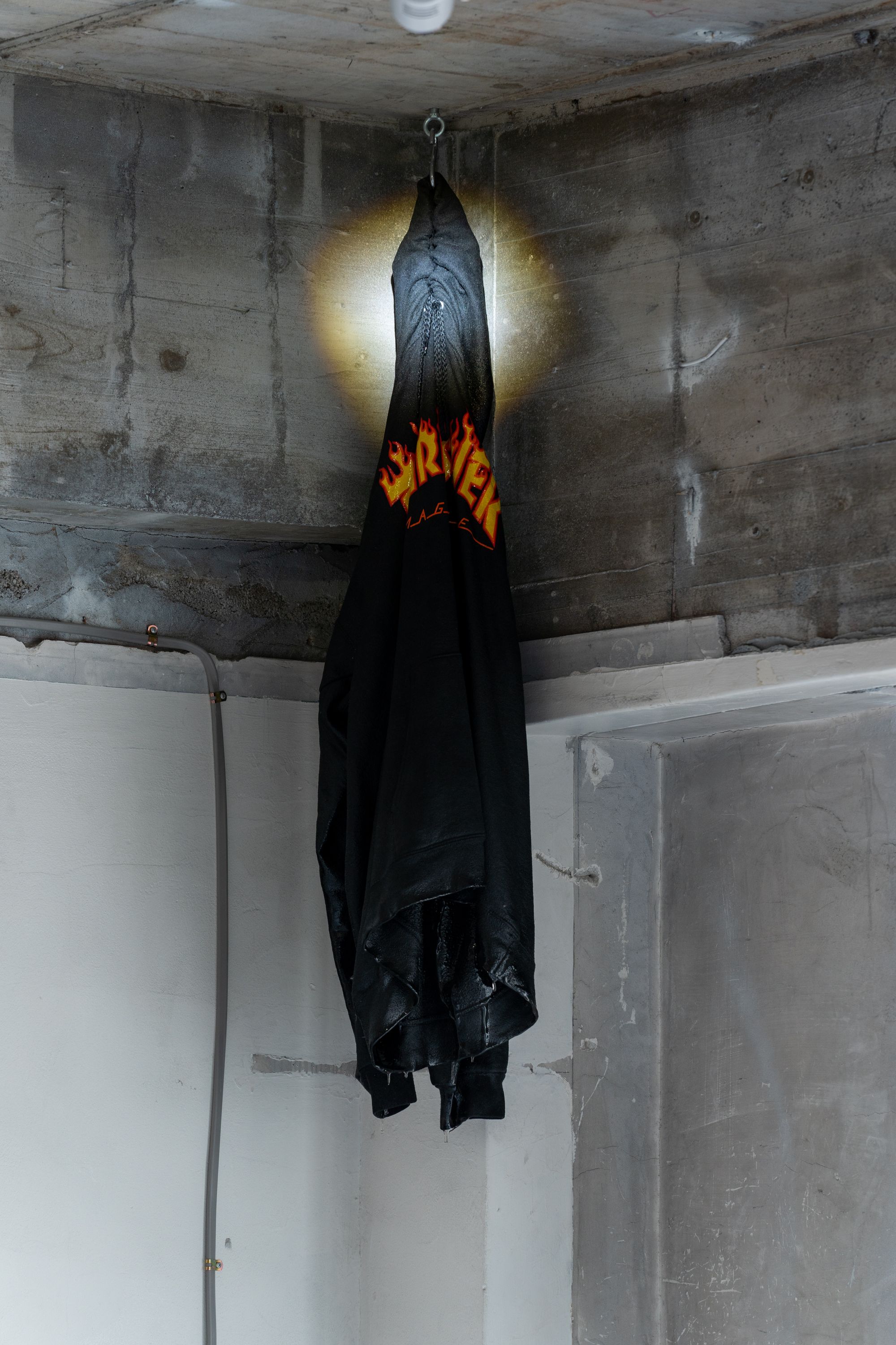
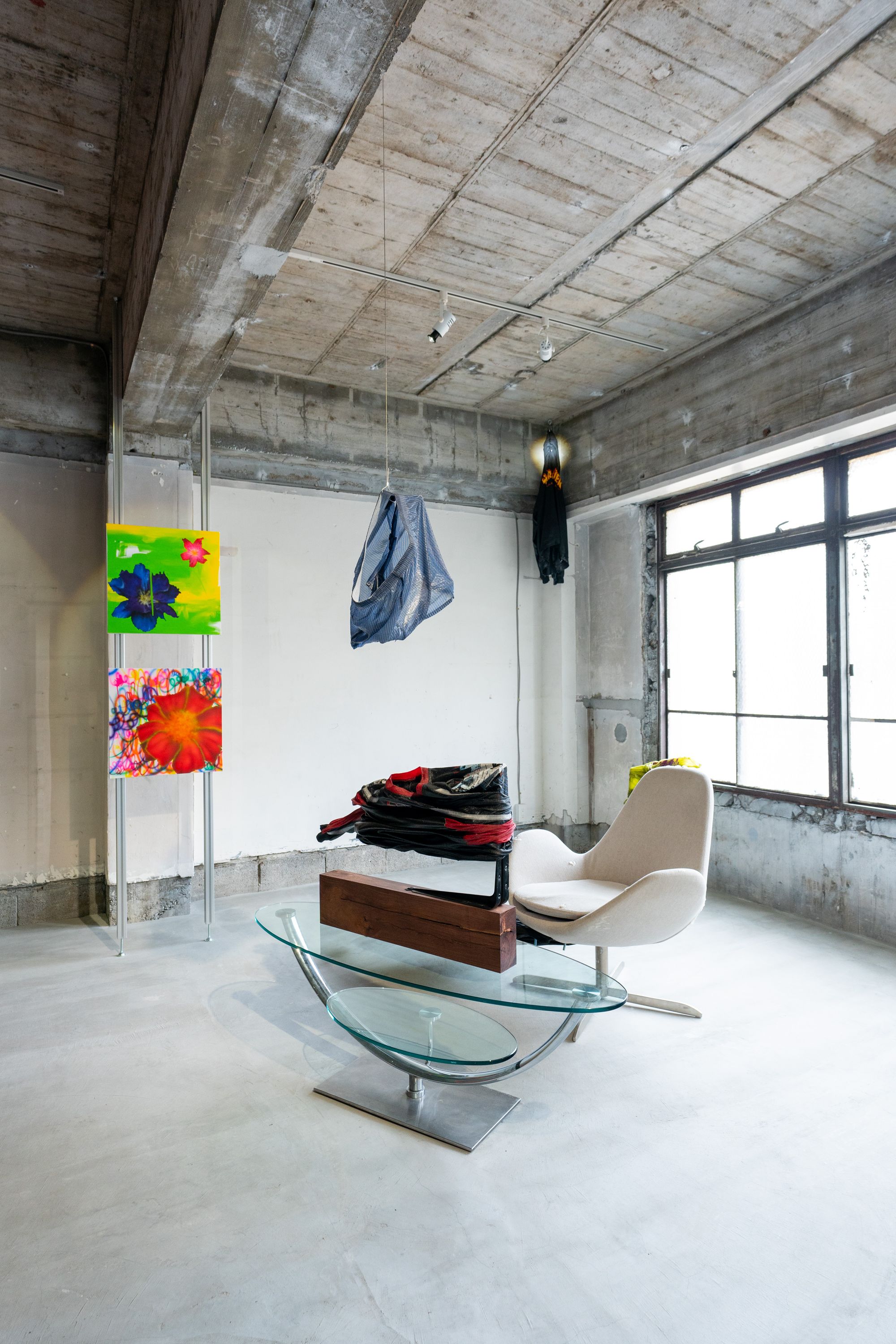
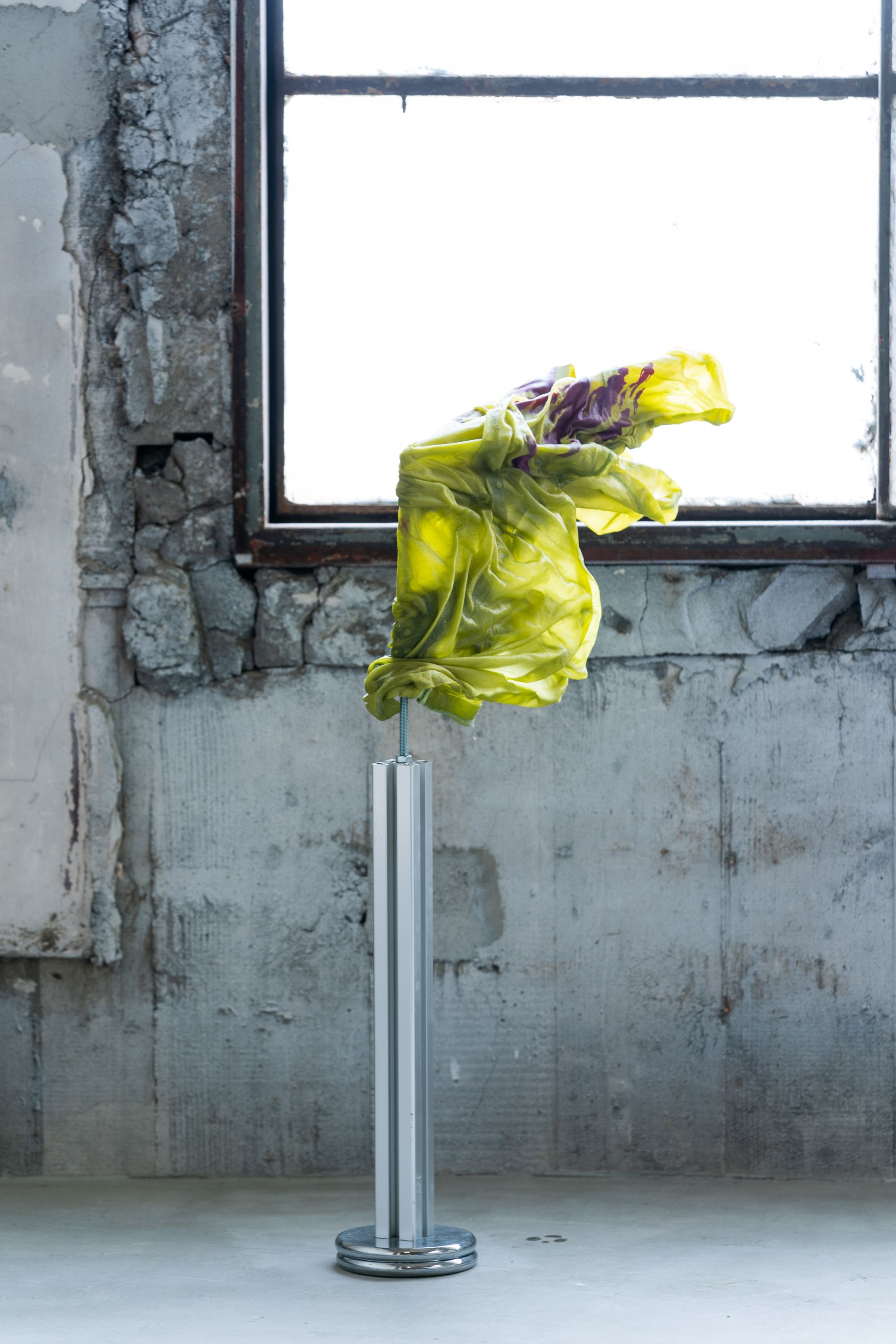
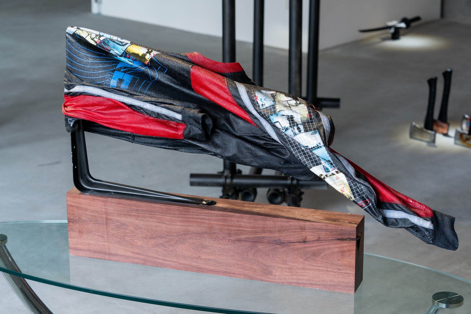
ギロチン:服をかけた「TROPHY」という作品を制作しました。これは僕やYoufire、和真、Tohjiなどいろいろな人から服をもらってきて、それぞれの名前を冠したトロフィーをつくったものです。猟師が雄鹿を狩って、戦利品として飾る首のことをハンティングトロフィーっていいます。それを若い青年たちの服でやってみたという感じです。作品が買われたあとの流れとしても、若い青年たちのトロフィーがお金持ちのコレクターの方々の家に飾られていたら、ちょっとグロテスクな状況が生まれて面白いですよね。
こうしたアイデアは、いくつかの自分の経験や考えから生まれました。まず、幼馴染の友達の家に行ったら、鹿の首が飾ってあったんですよ。友達のお父さんが猟師をやってて。そういうものを飾るのって少し昔の文化、それもお金持ちの文化ですよね。これって、現代に置き換えたらコレクターみたいなものだなと思いました。それなら鹿の首にあたる作品をつくるとしたらどうなるかと考えていった。
山本:展示の話をしているときにした、人身事故の話も聞いたな。
ギロチン:うん。高校生のころに同級生が人身事故で自殺したことがあって。クラスメイトだったから記憶に残っていたんですけど、その二、三ヶ月後に今度は実際に人身事故を見て。電車の前に服がへばりついていて、でも血は出ていない。正直、全然人間のようにはみえませんでした。そのときのイメージが作品に反映されています。
それから、僕がずっと都市と青年についての作品をつくっているということもあります。今回でいえば、少年漫画や青年漫画に出てくるキメのコマで、青年の衣服が強調される演出。ああいうものを意識しました。ほかに影響を受けた作品としては、アメリカのロバート・ロンゴというアーティストの「Men in the Cities」というシリーズがあります。これは役者たちが銃で撃たれて殺される映画のシーンから発想を得て制作されたドローイングのシリーズですが、服のうねりが印象的でした。鹿の首、人身事故、マンガのなかの衣服、銃で撃たれて死ぬ青年たち……そういったイメージがつながって今回の作品が生まれました。
[転載と転売、そして驚異の部屋──Youfire]
──最後に、Youfireさんの作品について。
Youfire:untitled(AFX)などの斧のシリーズやuntitled(Tarkus)などのバイクなど、今回出品した自分の作品全体についてコメントしたいと思います。まず、〈斧〉は自分で触った箇所がかなり少ない作品です。斧自体はAmazonで買ったものだし、画像はどこかから持ってきたもの。斧のマットブラックの塗装は、Instagramで画像をひたすら無断転載しているwelcome.jpegのように、"趣味の良いアイコンとユーザー名"がもつ効果を狙ったものです。やろうと思えば、モノとしてのクオリティはいくらでもあげられるんですが、それをあえてやっていません。「めんどくさいからやらない」っていう普通の感覚を大事にしています。そこには粗悪品を売って小遣いを稼ぎ、自分はハイプなスニーカーを買うような「ズルさ」を残し続けたいという考えがあります。
山本:この作品は画像のペラペラした表層的な印象と、モノとしての攻撃力が高くて重い感じとが両立しているところがいいよね。
Youfire:モチーフはいくつかあって、まず先ほど紹介したwelcome.jpgです。こういう趣味の良さだけでフォロワーを増やし続けるアカウントが気になっています。
あと転売ヤーですよね。NIKEの北米地区副社長の息子がヤバい転売ヤーだったみたいな話もあって。そいつはハイプなスニーカーを転売してめちゃくちゃ儲けていたっていう。あるいは、BALENCIAGAのTriple Sの偽物を売りまくっている中国人のInstagramとか。ハイプなスニーカーを大量に並べてピースとかしてて、やたらカッコよかったり。
それから時代が飛ぶんですが、大航海時代の「Wunderkammer(ヴンダーカンマー)」──日本語で驚異の部屋と呼ばれるものです。これは貴族が自分の権力を見せびらかすために、海賊があちこちで掻っ払ってきた宝物を展示するコレクションです。ブートレグって言葉がありますけど、日本語にすると海賊盤ですよね。あ、これも海賊だなって。
ギロチン:Youfireの作品は、どれも自分の好きな画像が立体化したような感じ。暴力性と清潔さ、薄っぺらさ、この展示でやりたいことが詰まっているよね。
Youfire:こういう他人のユーモアを自分の趣味の良さやキッチュに変えるズルさって、インターネットが生まれるまでは貴族のような特権的な人たちにしかわからない世界だったんじゃないかと思うんです。welcome.jpegは、かつてなら貴族やお坊ちゃまのものだったのかもしれない。そして、このズルさを美術でやっている人って、俺の知る限りではいない。もちろん、そういう文脈がわからなくても、ビジュアルとしてヤバいものをつくりたいんですけど。
[中間の場所]
──三人の作品は今回の展示空間とも合っているように感じます。
山本:床が木でできている藝大のようなスペースとも違うし、もちろんホワイトキューブでもない。なんていうか、こういうちょっと廃墟っぽい雰囲気のところでやったことがなかったし新鮮です。
Youfire:俺はホワイトキューブも好きなんだけど、このくらいの規模の展示空間で、心から納得できる完璧なホワイトキューブを見たことがないんですよね(笑)。大きい美術館とかだったら可能かもしれないけど。反対に、和真が言ってた木のぬくもりみたいなものや、アンダーグラウンドなものだったらいいかと言われたらそれも違うし。ここは一見廃墟のようなアングラ感もあるけど、床はやたらに綺麗で、ビルの三階で窓が大きく明るい。中間的な場所になっているところがいいなと感じます。
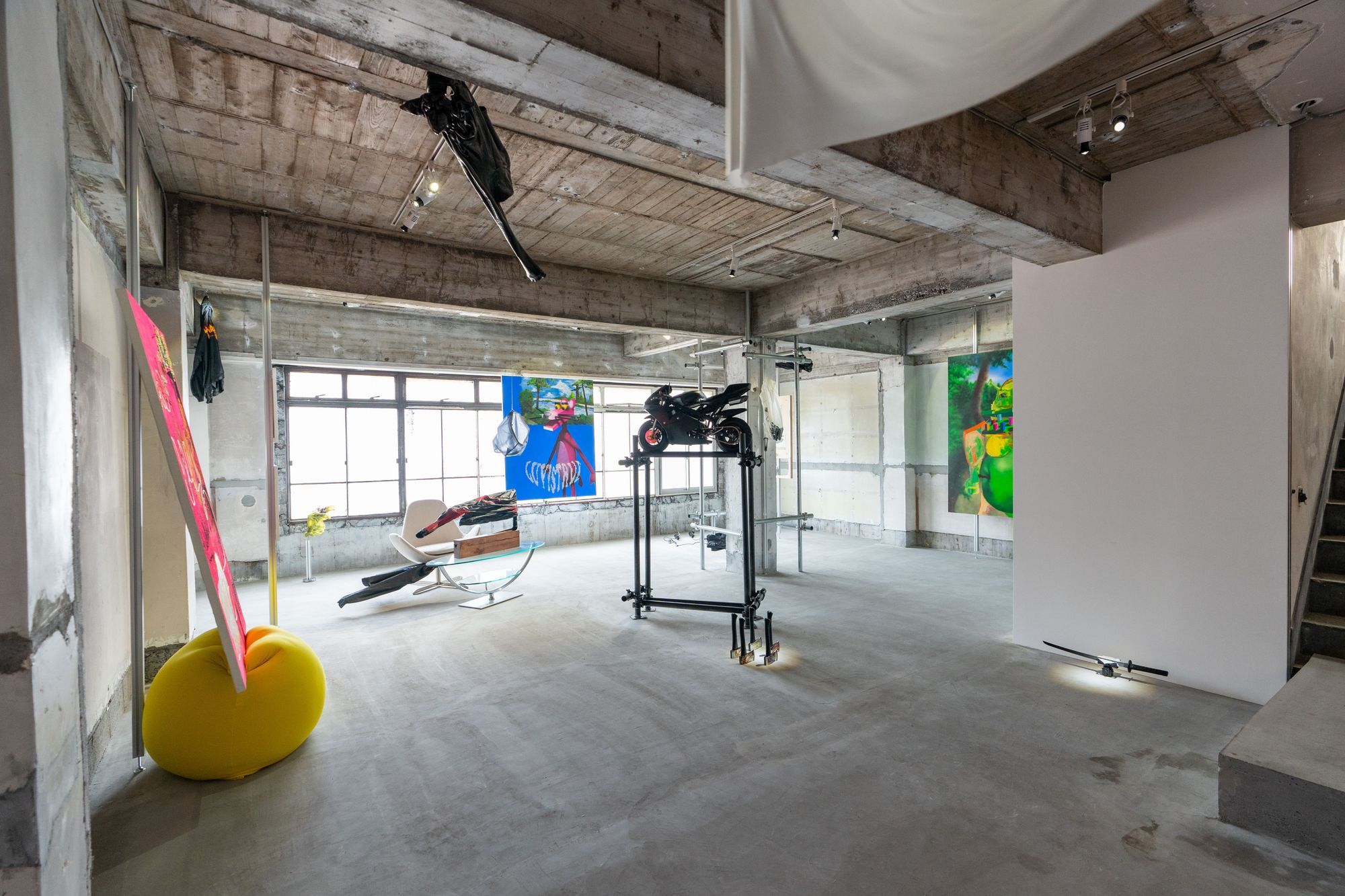
ギロチン:僕自身は今後もここで展示をディレクションしていくので、場所自体をどういうものにしたいかCON_の加藤さんや遠山さんと議論を重ねました。施工の段階から壁を建てるか建てないか、壁を塗るか塗らないか、床をどうするか。既存のギャラリーやスペースとは違うものにしたくて、いろいろ考えた結果、今の状態にたどり着いています。そういう空間演出も含めて、展示をみてもらえたらと思います。

<!--/JA--> <!--EN-->
"Ultra-thin inframince" is an exhibition by GILLOCHINDOX☆GILLOCHINDAE, Youfire, and Kazuma Yamamoto. Marking the inaugural opening of the gallery CON_, the exhibition was developed through a process in which each artist worked autonomously while continuously exchanging images and sharing sensibilities with one another. We spoke with the three artists—connected through imagery and sharing motifs such as the city, ready-made objects, and play—about their creative processes and individual works.
Text: Seshimo Shota
All Photo: Naoki Takehisa
Title: Ultra-thin (極薄) Artist: GILLOCHINDOX☆GILLOCHINDAE, Kazuma Yamamoto, Youfire
Term: April 2 (Sat) – May 1 (Sun), 2022 Opening reception: April 1 (Fri), 18:00–21:00
at CON_
── First, could you tell us about the concept of this exhibition?
GILLOCHINDOX☆GILLOCHINDAE (hereafter, Gillotine): The title combines Marcel Duchamp's coined term "inframince" with its Japanese translation "極薄" (gokuusu / ultra-thin). I first came across the word "inframince" in a book, and when I shared it with the other two, they responded well to it.
Yamamoto: I didn't know the word until Gillotine told me about it. When I looked into it, I realized it was close to what I had been thinking about. In Japanese it's translated as "極薄," but semantically it seems to go beyond mere thinness. That resonated with me.
Gillotine: There's even some debate that the translation might be slightly off. I find that sense of a "mis-translation" in the word "極薄" interesting.
Youfire: I also like the backstory—that it was an obscure note discovered after Duchamp's death. Personally, I'm a huge fan of Duchamp as something to observe, and my work can be seen as ready-made in its own way, so the concept felt natural.
Another important aspect is the visual attractiveness and sonic quality of the characters themselves. In the end, placing "極薄" alongside "inframince" to form "極薄inframince" worked really well. We swapped the words around and tried different combinations before settling on this form.
Yamamoto: Yeah, I like how it feels like a movie title—"極薄──inframince" has that subtitle-like quality.
[Exchanging Images Endlessly]
── What was the process like for developing the concept and creating the works?
Gillotine: Once we decided to do the exhibition, we first shared our backgrounds to get on the same wavelength. Toys we liked as kids, what clubs we were in during junior high school, and so on. Then we started sharing favorite words—anything from off-the-cuff ideas to things we'd found in books. The concept emerged from that process.
Yamamoto: Once production started, it wasn't so much discussion as it was an exchange of images.
Gillotine: Right. We endlessly shared images in an Instagram DM group. This one's OK, this one's not—that kind of thing. Rather than discussing each other's concepts in depth, that was our mode of communication.
Youfire: Replying to images with images. Not only references, but any works, exhibitions, or even clothing we liked—we shared all of it.
Yamamoto: This process was important. I only had two people I used to exchange images with for inspiration—a friend from the Intermedia Art department at Tokyo University of the Arts, and a high school classmate who now runs a real estate company. I didn't have many others with whom I could share this kind of sensibility, and on top of that, this was my first actual exhibition.
── Interesting. How did the three of you come to do this exhibition together?
Gillotine: Since I'm also directing the overall exhibition, I decided in conversation with Kato and Toyama of CON_. We talked about wanting to work with artists whose work wasn't like what other galleries had shown, and thought Youfire and Kazuma would fit.
I hadn't met them before, but their works shared common motifs, and the atmosphere of the images and memes they posted on Twitter and Instagram was somehow similar. I felt our values aligned.
Yamamoto: All three of us are constantly posting images. We're all image-driven, I think.
Youfire: That's true. Gillotine first DM'd me saying "come to my upcoming 獸 exhibition," and I thought—maybe I'm being scouted. And when I showed up, I actually was (laughs).
Gillotine: Exactly. I invited Youfire first, then DM'd Kazuma the same way, and went together with Youfire to Geidai.
Yamamoto: We first met in the Geidai cafeteria and showed each other our favorite artists and images.
Youfire: When I met them, I thought our approach to social media—how we present ourselves—felt similar. Hard to explain, but not loudly performing on Twitter, not affecting an underground pose either.
Yamamoto: That sensibility in both of you felt trustworthy.
Gillotine: Not just on social media—thinking about exhibitions too, it's unhealthy to lean so far underground that no money comes in and you have to quit, but leaning too far into street art or print movements also feels off. Holding that middle ground is important.
[From Fake Motifs ── Kazuma Yamamoto]
── So that's how the concept and content took shape. Could you each talk about your works? First, about Kazuma's work "Non Believer"—a simple question, but what is the text "ses"?
Yamamoto: "Ses" is the title of a discontinued Turkish magazine from the 1960s. I built this work by taking such motifs and chaining them together like a game of free association, inspired by Freud's method. The upper portion references Cézanne's "The Large Bathers"—I removed the human figures from the original painting and replaced them with a human-like animal, the Pink Panther. I then placed rhinestones derived from the pale pink diamond that gave the Pink Panther its name, producing a sense of "surface-level fakeness." Immaturity, clumsiness, and crudeness common to fakes are recurring themes in my work.
Gillotine: It's really good. I just love the immediate visual of Kazuma's work. Hearing the explanation made me appreciate it even more.
Yamamoto: Thanks. "Honey FARMS" has a similar fake quality. It references the DreamWorks animated film "Bee Movie." You know Disney's "A Bug's Life"? DreamWorks Animation tried to compete by making films with ants and bees—"Antz" and "Bee Movie"—but they couldn't beat Disney. "Honey FARMS" in the painting is a fictional apiary logo from "Bee Movie." From the bees' perspective, it symbolizes evil—a place where their comrades are abducted and imprisoned; from the human perspective, it's an apiary and honey company that supports the food supply. I found it interesting how the trickster figure of myth has been flattened by popular storytelling into something like "Honey FARMS," existing as a trickster in whom good and evil coexist depending on perspective. I thought it was interesting to have a flimsy "too-thin" logo inside a flimsy work—it resonates with the exhibition's concept.
Finally, "Flower2," "Flower3," and "868.07" depict real flowers—but they're poisonous. Despite being toxic, I paint them as brightly and safely as possible. Creating a thin, safe-looking entryway to lure viewers into something poisonous is a gimmick and concept that runs throughout my work. I also leave unpainted areas, dripping paint, and thick impasto so they read as paintings rather than as pop art. I want them seen properly as paintings—doing something Photoshop can't do.
[City and Youth ── GILLOCHINDOX☆GILLOCHINDAE]
── Next, could you tell us about your works, Gillotine?
Gillotine: I made a piece called "TROPHY," which uses hung clothing. I collected clothes from myself, Youfire, Kazuma, Tohji, and others, and made trophies bearing each person's name. When a hunter shoots a stag and mounts the head as a spoil, that's called a hunting trophy. I did that with the clothing of young men. I also find it interesting to imagine what happens after a work is purchased—if trophies of young men end up in the homes of wealthy collectors, something slightly grotesque unfolds.
These ideas came from several of my own experiences and thoughts. First, I once visited a childhood friend's house where a deer head was displayed—his father was a hunter. Displaying something like that is a somewhat older culture, a wealthy person's culture. In a contemporary context, that's essentially like a collector, I thought. So I began to think about what a work equivalent to that deer's head might look like.
Yamamoto: You also mentioned the story about the train suicide when we were discussing the exhibition.
Gillotine: Yes. In high school, a classmate of mine committed suicide by jumping in front of a train. It stayed with me, and two or three months later I actually witnessed a similar incident. There was clothing stuck to the front of the train, but no blood. Honestly, it didn't look like a human being at all. That image is reflected in the work.
Also, I've consistently made works about the city and youth. In this exhibition, I was conscious of those cinematic "decisive panels" in boys' and young men's manga where the youth's clothing is dramatically emphasized. Another influence is the American artist Robert Longo's series "Men in the Cities"—drawings inspired by movie scenes of actors being shot and killed. The flowing lines of the clothing are striking. The deer head, the train incident, clothing in manga, young men being shot to death—these images connected and gave rise to this work.
[Reposting, Reselling, and the Wunderkammer ── Youfire]
── Finally, about Youfire's work.
Youfire: I'd like to comment on all of my works in this show—the axe series like untitled(AFX) and the motorcycle piece untitled(Tarkus). First, the axes are works I barely touched myself. The axes themselves are bought from Amazon, and the images come from somewhere online. The matte black coating on the axes aims at the effect of a "tasteful icon and username"—like welcome.jpeg, an Instagram account that just endlessly reposts images without permission. I could raise the material quality of the object as much as I wanted, but I deliberately don't. I value the ordinary mindset of "I can't be bothered, so I won't." I want to preserve a "sneakiness"—like selling shoddy goods to make pocket change to buy hyped sneakers for myself.
Yamamoto: What's great about this work is that the flat, surface-level impression of the image coexists with the high-impact, heavy feel of the object itself.
Youfire: There are several motifs. First, welcome.jpeg that I just mentioned—I'm drawn to accounts that grow their following purely through good taste.
Then there are resellers. There was news about how the son of Nike's North America Vice President turned out to be a major reseller—making massive profits reselling hyped sneakers. Or the Instagram accounts of Chinese sellers pushing fake BALENCIAGA Triple S sneakers—lining up tons of them and flashing peace signs, somehow looking remarkably cool.
Skipping ahead historically, there's the "Wunderkammer" of the Age of Exploration—in Japanese, the "chamber of wonders." These were collections where nobles displayed treasures that pirates had plundered from various places, as a show of their power. There's a word "bootleg"—in Japanese "kaizokuban" (pirate edition). Ah, that's also piracy, I thought.
Gillotine: Youfire's works all feel like three-dimensional versions of images I like. Violence and cleanliness, flimsiness—they contain everything we wanted to do in this exhibition.
Youfire: This sneakiness of converting someone else's humor into your own good taste or kitsch—before the internet, this was a world only accessible to privileged classes like the aristocracy. Welcome.jpeg might once have belonged to nobles or young aristocrats. And as far as I know, no one in the art world is doing this kind of sneakiness. Of course, even without knowing that context, I want to make things that are visually striking.
[A Place In-Between]
── The three of your works seem to suit the exhibition space well.
Yamamoto: It's different from a wooden-floored space like Geidai, and it's obviously not a white cube. I'd never shown work in a place with this slightly ruin-like atmosphere, so it felt fresh.
Youfire: I also like white cubes, but at this scale of exhibition space, I've never seen a truly perfect white cube that I was completely satisfied with (laughs). At major museums it might be possible. But conversely, the warmth of wood Kazuma mentioned, or something underground—that's not quite right either. This place looks ruin-like and underground at first glance, but the floor is impeccably clean, and it's on the third floor with large windows and lots of light. I appreciate that it sits in-between.
Gillotine: Since I'll continue directing exhibitions here, I had many discussions with Kato and Toyama of CON_ about what kind of place it should be. From the construction stage—whether to build walls or not, whether to paint them or not, what to do with the floor. We wanted something different from existing galleries and spaces, and after considering everything, we arrived at the current state. I hope viewers see the exhibition including this spatial direction.
<!--/EN-->
<!--JA-->
GILLOCHINDOX☆GILLOCHINDAE、Youfire、山本和真による展示「極薄inframince」。ギャラリー「CON_」のこけら落としでもある本展は、作家が自律的に制作をおこないつつも、その間ひたすら画像を送り合い、ノリをシェアしながらつくられた。イメージを通じてつながり、都市や既製品、遊戯といったモチーフを共有する三人の制作過程や、それぞれの作品について聞く。
Text: Seshimo Shota All Photo: Naoki Takehisa
Title: Ultra-thin(極薄)
Artist: GILLOCHINDOX☆GILLOCHINDAE, Kazuma Yamamoto, Youfire
Term: 2022.4.2(SAT) - 5.1(SUN) Opening reception: 4.1(FRI) 18:00-21:00
at CON_
──まずはじめに、今回の展示のコンセプトを教えてください。
GILLOCHINDOX☆GILLOCHINDAE(以下、ギロチン):マルセル・デュシャンの造語「inframince」(アンフラマンス)を、その日本語訳でもある「極薄」と連ねたものです。最初はinframinceという言葉を僕が本で見つけました。それで二人に共有したら反応がよくて。
山本:僕はギロチンに言われるまでこの言葉は知りませんでした。調べていったら、もともと自分が考えていたことに近かった。アンフラマンスって、日本語で訳すと極薄って言い方になるけど、意味的には薄さを超えているみたいなことなんですよね。そこにしっくりきました。
ギロチン:ちょっと誤訳かもしれないっていう議論もあって、極薄って表現の誤訳しちゃった感じがおもしろいですよね。
Youfire:死後に発見されたよくわからないメモっていう背景もカッコいい。個人的には、観る対象としてデュシャンがめちゃくちゃ好きだし、俺の作品はレディメイドといえばレディメイドだし、そういう意味でも違和感はなかったかな。
あと大事だと思うのは、文字の視覚的なカッコよさや響き。最終的に「極薄」と「inframince」を並べて、「極薄inframince」としたことがよかったです。途中で何度か言葉を入れ替えたり、いろいろ試したりして、このかたちに落ち着いた。
山本:そうだね。映画のタイトルというか、「極薄──inframince」みたいな副題っぽい感じが好き。
[ひたすら画像を送り合う]
──コンセプトづくりや制作の過程はどういうものでしたか?
ギロチン:展示をやることになって、まずそれぞれのバックグラウンドを共有して、ノリを合わせる作業をやりました。小さいころに好きだったオモチャとか、中学校の部活とか、いろいろ聞いていって。そのあと好きな単語を共有していきました。てきとうに思いついた言葉から本で見つけたものまで。コンセプトもそのなかで生まれています。
山本:制作が始まってからは、話し合うっていうより、画像のやりとりって感じだったよね。
ギロチン:そうそう。InstagramのDMグループで延々と画像を共有していった。これはオッケー、これはダメ、みたいな。それぞれの作品のコンセプトを深く聞くというよりは、そういうコミュニケーションの仕方ですね。
Youfire:画像に画像で返していく感じ。いわゆるリファレンスになるものだけじゃなくて、制作と関係ないけどよかった作品とか展示とか、服とかもどんどんシェアして。
山本:この工程が大事だったと思う。僕には画像を送り合って刺激を受ける知り合いが二人いて、藝大の先端の友人と、いま不動産の会社をやっている高校の同級生なんですけど。そういうふうに感覚を共有できる人たちはほかにいなかったし、まして実際に展示をやるのは今回が初めてだったから。
──おもしろいですね、この三人で展示をやろうということになった経緯はどのようなものだったんですか?
ギロチン:僕は展示全体のディレクションもやっているので、CON_の加藤さんや遠山さんと話しながら決めました。最初の展示だしこれまでのギャラリーにないような作品をつくるアーティストと一緒にやりたいねって会話があって、Youfireと和真が合うんじゃないかって。
二人と会ったことはなかったけど、作品自体にも共通するモチーフがあるし、TwitterやInstagramにあげている画像やミームの雰囲気もなんとなく似ている。価値観が合う気がしました。
山本:三人ともずっと画像をあげてるよね。イメージの強い人たちなんだと思う。
Youfire:そこは本当に似てる。最初にギロチンから「今度〈獸〉の展示に来てほしい」ってDMが来て、そのときワンチャン誘われるのかなと思った。で、行ったら本当に誘われた(笑)。
ギロチン:そうそう。先にYoufireを誘って、そのあと同じように和真にもDMして、Youfireと一緒に藝大に乗り込んだ。
山本:最初は藝大の食堂で会って、それぞれの好きなアーティストとか画像とかをいろいろ見せ合いました。
Youfire:会ったときにも思ったけど、SNSの使い方というか、振る舞い方も共通している感じがする。うまく言えないけど、Twitterでデカい声でコミュニケーションするわけでもなく、アンダーグラウンドを気取るわけでもなくみたいな。
山本:二人のそういう感覚は信頼できるなって思ったよ。
ギロチン:SNSだけじゃなくて、展示を考えるうえでも、アンダーグラウンドに寄りすぎてお金が回らなくてリタイアするのも不健康だし、ストリートアートやプリンティングのムーブメントに寄りすぎるのも違うような気がするからね。その間をちゃんと保つっていうか。
[偽物のモチーフから──山本和真]
──そうして展示のコンセプトや内容が決まっていったと。それぞれの作品についても聞いていいですか。まず、山本さんの作品「Non Believer」について。素朴な質問ですが、この「ses」って文字はなんでしょうか。
山本:「ses」は、トルコの廃盤になった60年代の雑誌のタイトルですね。この作品はそういったモチーフをフロイトの自由連想法からヒントを得て、連想ゲームのように連鎖させて制作しています。上にあるのはセザンヌの大水浴を参照したもので、実際の絵画では人間が描かれているのですが消してしまい、代わりに人間っぽい動物としてピンクパンサーを描きました。さらにピンクパンサーの由来となった薄桃色のダイアモンドからラインストーンも置いて、「表層的な偽物らしさ」を出しています。偽物に共通する未成熟さや下手さ、稚拙さは、僕の作品のテーマです。
ギロチン:ほんといいよね、これ。和真の作品は、まずパッと見のビジュアルがめっちゃ好き。説明を聞いて、さらにわかってきた感じがする。
山本:ありがとう。同じように「Honey FARMS」にも偽物感があります。これはドリームワークスの「ビー・ムービー」っていうアニメーション映画を引用したものです。ディズニーの「バグズ・ライフ」ってありますよね。ドリームワークスアニメーションはその人気に対抗して、「アンツ」とか「ビー・ムービー」とか、アリやハチが出てくる作品を制作するんだけど、ディズニーには勝てなかった。絵のなかにある「Honey FARMS」は、「ビー・ムービー」に出てくる架空の養蜂場のロゴです。この養蜂場はハチからみると仲間を拉致して監禁する悪の象徴であり、人間から見ると食を支える養蜂場でありハチミツ会社。神話におけるトリックスターの存在が、大衆の物語の中で形骸化され、立場によって善と悪が同居するトリックスターとして「Honey FARMS」の存在が成立しているのが面白いと思った。ペラペラの作品のなかに、ペラペラの「薄すぎる」ロゴがあるところが、展示のコンセプトとも響き合っていておもしろいかなと。
最後に「Flower2」「Flower3」「868.07」などは、実際にある花ですが、毒をもっています。毒がありながらも、なるべく明るく、安全に見せるように描いています。毒を持ったものに薄い安全に見える入り口を作り鑑賞者を誘引する仕掛けも僕の作品で共通するギミックでありコンセプトとしてあります。そして、いわゆるポップアートではなく絵として見られるように、塗り残しがあったり、絵の具の垂れているところや盛られているところがあったりします。ちゃんと絵画として見てほしいというのも自分の作品に共通している点ですね。Photoshopではできないことをやるぞっていう。
[都市と青年──GILLOCHINDOX☆GILLOCHINDAE]
──続いて、ギロチンさんの作品についても教えてください。
ギロチン:服をかけた「TROPHY」という作品を制作しました。これは僕やYoufire、和真、Tohjiなどいろいろな人から服をもらってきて、それぞれの名前を冠したトロフィーをつくったものです。猟師が雄鹿を狩って、戦利品として飾る首のことをハンティングトロフィーっていいます。それを若い青年たちの服でやってみたという感じです。作品が買われたあとの流れとしても、若い青年たちのトロフィーがお金持ちのコレクターの方々の家に飾られていたら、ちょっとグロテスクな状況が生まれて面白いですよね。
こうしたアイデアは、いくつかの自分の経験や考えから生まれました。まず、幼馴染の友達の家に行ったら、鹿の首が飾ってあったんですよ。友達のお父さんが猟師をやってて。そういうものを飾るのって少し昔の文化、それもお金持ちの文化ですよね。これって、現代に置き換えたらコレクターみたいなものだなと思いました。それなら鹿の首にあたる作品をつくるとしたらどうなるかと考えていった。
山本:展示の話をしているときにした、人身事故の話も聞いたな。
ギロチン:うん。高校生のころに同級生が人身事故で自殺したことがあって。クラスメイトだったから記憶に残っていたんですけど、その二、三ヶ月後に今度は実際に人身事故を見て。電車の前に服がへばりついていて、でも血は出ていない。正直、全然人間のようにはみえませんでした。そのときのイメージが作品に反映されています。
それから、僕がずっと都市と青年についての作品をつくっているということもあります。今回でいえば、少年漫画や青年漫画に出てくるキメのコマで、青年の衣服が強調される演出。ああいうものを意識しました。ほかに影響を受けた作品としては、アメリカのロバート・ロンゴというアーティストの「Men in the Cities」というシリーズがあります。これは役者たちが銃で撃たれて殺される映画のシーンから発想を得て制作されたドローイングのシリーズですが、服のうねりが印象的でした。鹿の首、人身事故、マンガのなかの衣服、銃で撃たれて死ぬ青年たち……そういったイメージがつながって今回の作品が生まれました。
[転載と転売、そして驚異の部屋──Youfire]
──最後に、Youfireさんの作品について。
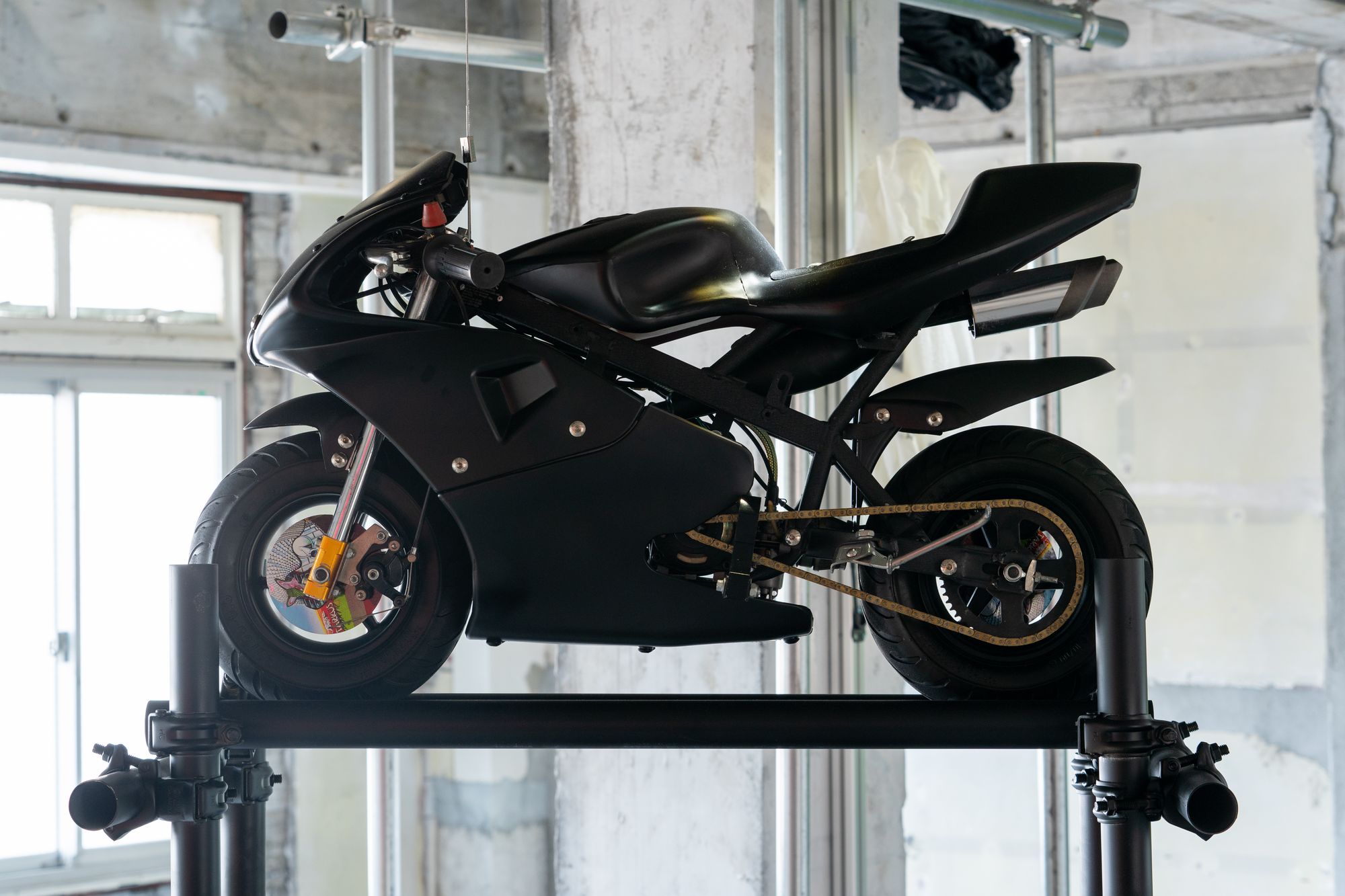
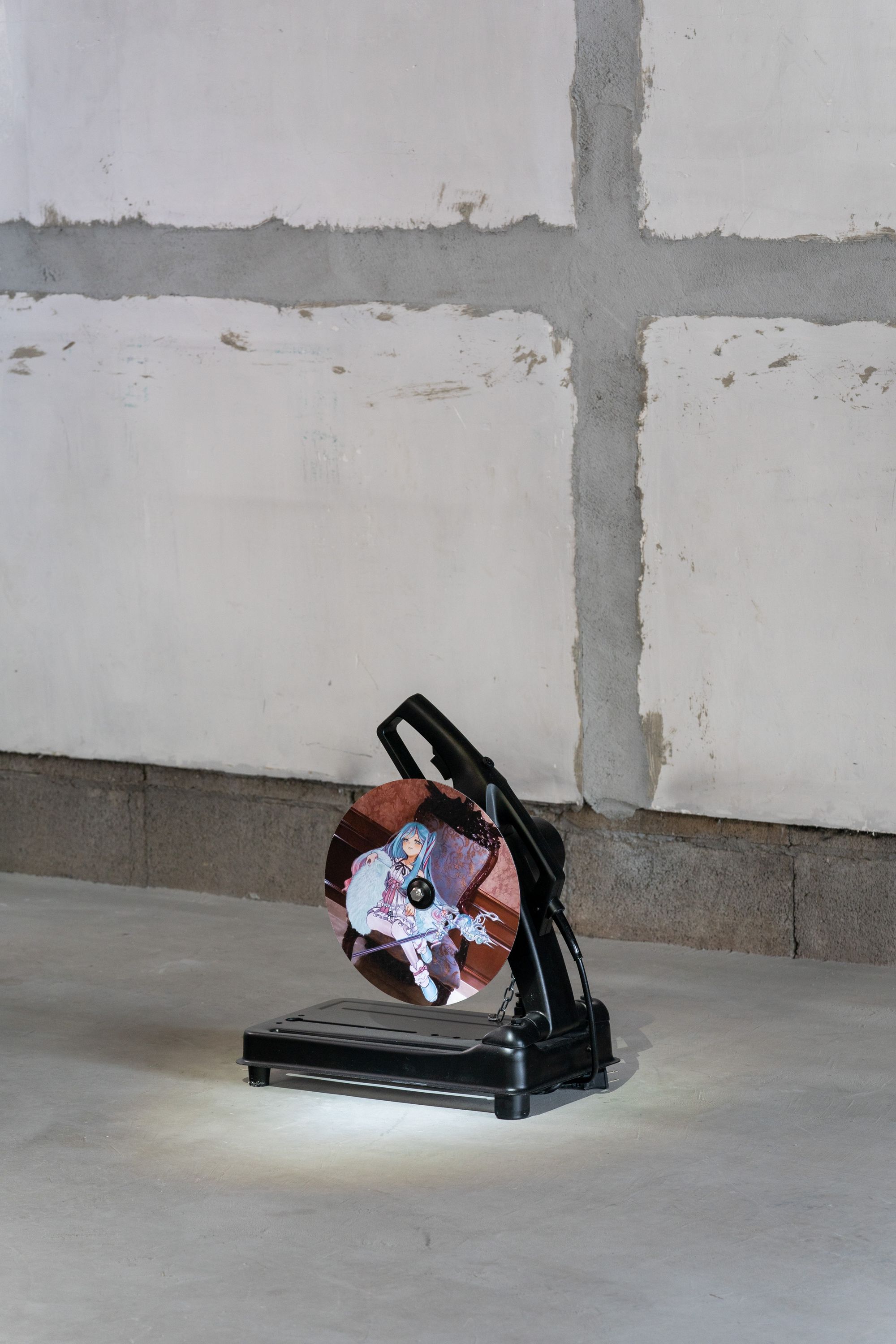
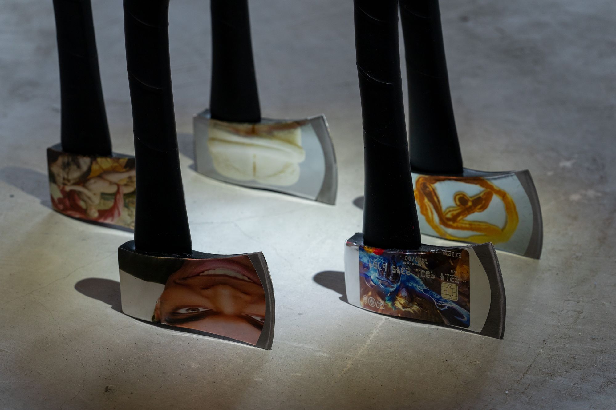
Youfire:untitled(AFX)などの斧のシリーズやuntitled(Tarkus)などのバイクなど、今回出品した自分の作品全体についてコメントしたいと思います。まず、〈斧〉は自分で触った箇所がかなり少ない作品です。斧自体はAmazonで買ったものだし、画像はどこかから持ってきたもの。斧のマットブラックの塗装は、Instagramで画像をひたすら無断転載しているwelcome.jpegのように、"趣味の良いアイコンとユーザー名"がもつ効果を狙ったものです。やろうと思えば、モノとしてのクオリティはいくらでもあげられるんですが、それをあえてやっていません。「めんどくさいからやらない」っていう普通の感覚を大事にしています。そこには粗悪品を売って小遣いを稼ぎ、自分はハイプなスニーカーを買うような「ズルさ」を残し続けたいという考えがあります。
山本:この作品は画像のペラペラした表層的な印象と、モノとしての攻撃力が高くて重い感じとが両立しているところがいいよね。
Youfire:モチーフはいくつかあって、まず先ほど紹介したwelcome.jpgです。こういう趣味の良さだけでフォロワーを増やし続けるアカウントが気になっています。
あと転売ヤーですよね。NIKEの北米地区副社長の息子がヤバい転売ヤーだったみたいな話もあって。そいつはハイプなスニーカーを転売してめちゃくちゃ儲けていたっていう。あるいは、BALENCIAGAのTriple Sの偽物を売りまくっている中国人のInstagramとか。ハイプなスニーカーを大量に並べてピースとかしてて、やたらカッコよかったり。
それから時代が飛ぶんですが、大航海時代の「Wunderkammer(ヴンダーカンマー)」──日本語で驚異の部屋と呼ばれるものです。これは貴族が自分の権力を見せびらかすために、海賊があちこちで掻っ払ってきた宝物を展示するコレクションです。ブートレグって言葉がありますけど、日本語にすると海賊盤ですよね。あ、これも海賊だなって。
ギロチン:Youfireの作品は、どれも自分の好きな画像が立体化したような感じ。暴力性と清潔さ、薄っぺらさ、この展示でやりたいことが詰まっているよね。
Youfire:こういう他人のユーモアを自分の趣味の良さやキッチュに変えるズルさって、インターネットが生まれるまでは貴族のような特権的な人たちにしかわからない世界だったんじゃないかと思うんです。welcome.jpegは、かつてなら貴族やお坊ちゃまのものだったのかもしれない。そして、このズルさを美術でやっている人って、俺の知る限りではいない。もちろん、そういう文脈がわからなくても、ビジュアルとしてヤバいものをつくりたいんですけど。
[中間の場所]
──三人の作品は今回の展示空間とも合っているように感じます。
山本:床が木でできている藝大のようなスペースとも違うし、もちろんホワイトキューブでもない。なんていうか、こういうちょっと廃墟っぽい雰囲気のところでやったことがなかったし新鮮です。
Youfire:俺はホワイトキューブも好きなんだけど、このくらいの規模の展示空間で、心から納得できる完璧なホワイトキューブを見たことがないんですよね(笑)。大きい美術館とかだったら可能かもしれないけど。反対に、和真が言ってた木のぬくもりみたいなものや、アンダーグラウンドなものだったらいいかと言われたらそれも違うし。ここは一見廃墟のようなアングラ感もあるけど、床はやたらに綺麗で、ビルの三階で窓が大きく明るい。中間的な場所になっているところがいいなと感じます。
ギロチン:僕自身は今後もここで展示をディレクションしていくので、場所自体をどういうものにしたいかCON_の加藤さんや遠山さんと議論を重ねました。施工の段階から壁を建てるか建てないか、壁を塗るか塗らないか、床をどうするか。既存のギャラリーやスペースとは違うものにしたくて、いろいろ考えた結果、今の状態にたどり着いています。そういう空間演出も含めて、展示をみてもらえたらと思います。
<!--/JA--> <!--EN-->
"Ultra-thin inframince" is an exhibition by GILLOCHINDOX☆GILLOCHINDAE, Youfire, and Kazuma Yamamoto. Marking the inaugural opening of the gallery CON_, the exhibition was developed through a process in which each artist worked autonomously while continuously exchanging images and sharing sensibilities with one another. We spoke with the three artists—connected through imagery and sharing motifs such as the city, ready-made objects, and play—about their creative processes and individual works.
Text: Seshimo Shota
All Photo: Naoki Takehisa
Title: Ultra-thin (極薄) Artist: GILLOCHINDOX☆GILLOCHINDAE, Kazuma Yamamoto, Youfire
Term: April 2 (Sat) – May 1 (Sun), 2022 Opening reception: April 1 (Fri), 18:00–21:00
at CON_
── First, could you tell us about the concept of this exhibition?
GILLOCHINDOX☆GILLOCHINDAE (hereafter, Gillotine): The title combines Marcel Duchamp's coined term "inframince" with its Japanese translation "極薄" (gokuusu / ultra-thin). I first came across the word "inframince" in a book, and when I shared it with the other two, they responded well to it.
Yamamoto: I didn't know the word until Gillotine told me about it. When I looked into it, I realized it was close to what I had been thinking about. In Japanese it's translated as "極薄," but semantically it seems to go beyond mere thinness. That resonated with me.
Gillotine: There's even some debate that the translation might be slightly off. I find that sense of a "mis-translation" in the word "極薄" interesting.
Youfire: I also like the backstory—that it was an obscure note discovered after Duchamp's death. Personally, I'm a huge fan of Duchamp as something to observe, and my work can be seen as ready-made in its own way, so the concept felt natural.
Another important aspect is the visual attractiveness and sonic quality of the characters themselves. In the end, placing "極薄" alongside "inframince" to form "極薄inframince" worked really well. We swapped the words around and tried different combinations before settling on this form.
Yamamoto: Yeah, I like how it feels like a movie title—"極薄──inframince" has that subtitle-like quality.
[Exchanging Images Endlessly]
── What was the process like for developing the concept and creating the works?
Gillotine: Once we decided to do the exhibition, we first shared our backgrounds to get on the same wavelength. Toys we liked as kids, what clubs we were in during junior high school, and so on. Then we started sharing favorite words—anything from off-the-cuff ideas to things we'd found in books. The concept emerged from that process.
Yamamoto: Once production started, it wasn't so much discussion as it was an exchange of images.
Gillotine: Right. We endlessly shared images in an Instagram DM group. This one's OK, this one's not—that kind of thing. Rather than discussing each other's concepts in depth, that was our mode of communication.
Youfire: Replying to images with images. Not only references, but any works, exhibitions, or even clothing we liked—we shared all of it.
Yamamoto: This process was important. I only had two people I used to exchange images with for inspiration—a friend from the Intermedia Art department at Tokyo University of the Arts, and a high school classmate who now runs a real estate company. I didn't have many others with whom I could share this kind of sensibility, and on top of that, this was my first actual exhibition.
── Interesting. How did the three of you come to do this exhibition together?
Gillotine: Since I'm also directing the overall exhibition, I decided in conversation with Kato and Toyama of CON_. We talked about wanting to work with artists whose work wasn't like what other galleries had shown, and thought Youfire and Kazuma would fit.
I hadn't met them before, but their works shared common motifs, and the atmosphere of the images and memes they posted on Twitter and Instagram was somehow similar. I felt our values aligned.
Yamamoto: All three of us are constantly posting images. We're all image-driven, I think.
Youfire: That's true. Gillotine first DM'd me saying "come to my upcoming 獸 exhibition," and I thought—maybe I'm being scouted. And when I showed up, I actually was (laughs).
Gillotine: Exactly. I invited Youfire first, then DM'd Kazuma the same way, and went together with Youfire to Geidai.
Yamamoto: We first met in the Geidai cafeteria and showed each other our favorite artists and images.
Youfire: When I met them, I thought our approach to social media—how we present ourselves—felt similar. Hard to explain, but not loudly performing on Twitter, not affecting an underground pose either.
Yamamoto: That sensibility in both of you felt trustworthy.
Gillotine: Not just on social media—thinking about exhibitions too, it's unhealthy to lean so far underground that no money comes in and you have to quit, but leaning too far into street art or print movements also feels off. Holding that middle ground is important.
[From Fake Motifs ── Kazuma Yamamoto]
── So that's how the concept and content took shape. Could you each talk about your works? First, about Kazuma's work "Non Believer"—a simple question, but what is the text "ses"?
Yamamoto: "Ses" is the title of a discontinued Turkish magazine from the 1960s. I built this work by taking such motifs and chaining them together like a game of free association, inspired by Freud's method. The upper portion references Cézanne's "The Large Bathers"—I removed the human figures from the original painting and replaced them with a human-like animal, the Pink Panther. I then placed rhinestones derived from the pale pink diamond that gave the Pink Panther its name, producing a sense of "surface-level fakeness." Immaturity, clumsiness, and crudeness common to fakes are recurring themes in my work.
Gillotine: It's really good. I just love the immediate visual of Kazuma's work. Hearing the explanation made me appreciate it even more.
Yamamoto: Thanks. "Honey FARMS" has a similar fake quality. It references the DreamWorks animated film "Bee Movie." You know Disney's "A Bug's Life"? DreamWorks Animation tried to compete by making films with ants and bees—"Antz" and "Bee Movie"—but they couldn't beat Disney. "Honey FARMS" in the painting is a fictional apiary logo from "Bee Movie." From the bees' perspective, it symbolizes evil—a place where their comrades are abducted and imprisoned; from the human perspective, it's an apiary and honey company that supports the food supply. I found it interesting how the trickster figure of myth has been flattened by popular storytelling into something like "Honey FARMS," existing as a trickster in whom good and evil coexist depending on perspective. I thought it was interesting to have a flimsy "too-thin" logo inside a flimsy work—it resonates with the exhibition's concept.
Finally, "Flower2," "Flower3," and "868.07" depict real flowers—but they're poisonous. Despite being toxic, I paint them as brightly and safely as possible. Creating a thin, safe-looking entryway to lure viewers into something poisonous is a gimmick and concept that runs throughout my work. I also leave unpainted areas, dripping paint, and thick impasto so they read as paintings rather than as pop art. I want them seen properly as paintings—doing something Photoshop can't do.
[City and Youth ── GILLOCHINDOX☆GILLOCHINDAE]
── Next, could you tell us about your works, Gillotine?
Gillotine: I made a piece called "TROPHY," which uses hung clothing. I collected clothes from myself, Youfire, Kazuma, Tohji, and others, and made trophies bearing each person's name. When a hunter shoots a stag and mounts the head as a spoil, that's called a hunting trophy. I did that with the clothing of young men. I also find it interesting to imagine what happens after a work is purchased—if trophies of young men end up in the homes of wealthy collectors, something slightly grotesque unfolds.
These ideas came from several of my own experiences and thoughts. First, I once visited a childhood friend's house where a deer head was displayed—his father was a hunter. Displaying something like that is a somewhat older culture, a wealthy person's culture. In a contemporary context, that's essentially like a collector, I thought. So I began to think about what a work equivalent to that deer's head might look like.
Yamamoto: You also mentioned the story about the train suicide when we were discussing the exhibition.
Gillotine: Yes. In high school, a classmate of mine committed suicide by jumping in front of a train. It stayed with me, and two or three months later I actually witnessed a similar incident. There was clothing stuck to the front of the train, but no blood. Honestly, it didn't look like a human being at all. That image is reflected in the work.
Also, I've consistently made works about the city and youth. In this exhibition, I was conscious of those cinematic "decisive panels" in boys' and young men's manga where the youth's clothing is dramatically emphasized. Another influence is the American artist Robert Longo's series "Men in the Cities"—drawings inspired by movie scenes of actors being shot and killed. The flowing lines of the clothing are striking. The deer head, the train incident, clothing in manga, young men being shot to death—these images connected and gave rise to this work.
[Reposting, Reselling, and the Wunderkammer ── Youfire]
── Finally, about Youfire's work.
Youfire: I'd like to comment on all of my works in this show—the axe series like untitled(AFX) and the motorcycle piece untitled(Tarkus). First, the axes are works I barely touched myself. The axes themselves are bought from Amazon, and the images come from somewhere online. The matte black coating on the axes aims at the effect of a "tasteful icon and username"—like welcome.jpeg, an Instagram account that just endlessly reposts images without permission. I could raise the material quality of the object as much as I wanted, but I deliberately don't. I value the ordinary mindset of "I can't be bothered, so I won't." I want to preserve a "sneakiness"—like selling shoddy goods to make pocket change to buy hyped sneakers for myself.
Yamamoto: What's great about this work is that the flat, surface-level impression of the image coexists with the high-impact, heavy feel of the object itself.
Youfire: There are several motifs. First, welcome.jpeg that I just mentioned—I'm drawn to accounts that grow their following purely through good taste.
Then there are resellers. There was news about how the son of Nike's North America Vice President turned out to be a major reseller—making massive profits reselling hyped sneakers. Or the Instagram accounts of Chinese sellers pushing fake BALENCIAGA Triple S sneakers—lining up tons of them and flashing peace signs, somehow looking remarkably cool.
Skipping ahead historically, there's the "Wunderkammer" of the Age of Exploration—in Japanese, the "chamber of wonders." These were collections where nobles displayed treasures that pirates had plundered from various places, as a show of their power. There's a word "bootleg"—in Japanese "kaizokuban" (pirate edition). Ah, that's also piracy, I thought.
Gillotine: Youfire's works all feel like three-dimensional versions of images I like. Violence and cleanliness, flimsiness—they contain everything we wanted to do in this exhibition.
Youfire: This sneakiness of converting someone else's humor into your own good taste or kitsch—before the internet, this was a world only accessible to privileged classes like the aristocracy. Welcome.jpeg might once have belonged to nobles or young aristocrats. And as far as I know, no one in the art world is doing this kind of sneakiness. Of course, even without knowing that context, I want to make things that are visually striking.
[A Place In-Between]
── The three of your works seem to suit the exhibition space well.
Yamamoto: It's different from a wooden-floored space like Geidai, and it's obviously not a white cube. I'd never shown work in a place with this slightly ruin-like atmosphere, so it felt fresh.
Youfire: I also like white cubes, but at this scale of exhibition space, I've never seen a truly perfect white cube that I was completely satisfied with (laughs). At major museums it might be possible. But conversely, the warmth of wood Kazuma mentioned, or something underground—that's not quite right either. This place looks ruin-like and underground at first glance, but the floor is impeccably clean, and it's on the third floor with large windows and lots of light. I appreciate that it sits in-between.
Gillotine: Since I'll continue directing exhibitions here, I had many discussions with Kato and Toyama of CON_ about what kind of place it should be. From the construction stage—whether to build walls or not, whether to paint them or not, what to do with the floor. We wanted something different from existing galleries and spaces, and after considering everything, we arrived at the current state. I hope viewers see the exhibition including this spatial direction.
<!--/EN-->